Maps are a great form of information systems. There is a lot to be seen and is easy to navigate with out words. Maps have a hierarchy which is similar to all maps making them universal. On the MET and MOMA trip to the city I found a booth that provided a map of central park. This map provided a lay out of the park and all of the trails and possible roots to take. At the booth a worker drew out where you were and gave you possible roots which were highlighted in a thick white line or main roads and thin white lines for side paths to get to where you wanted to be next. Our path brought us straight o the back of the MET where I was able to get another map that laid out the floors and building of both the MET and MOMA. Maps also provide a key which allows the viewer to see what each piece means making it easier to decipher with out words. There is a clear hierarchy in all maps where the more important/the more populated areas are larger and more visible then the small side roads/paths.


 Wix is a great example of an online portfolio and shared creative works site. Wix provides free use with a username and password. Wix starts you off by asking you questions to see what kind of a site you would like to create whether its for photography, business, blog, online store, portfolio and many more. After filling out this simple info Wix then leads you to example sites which you can look at and be inspired by and also gives you many templates to use or to start off with. I really like the amount of options available to use or just to view.
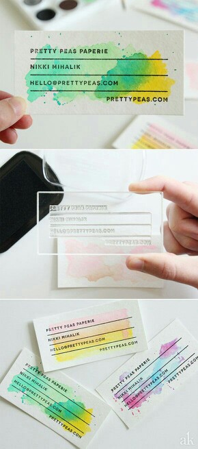 Everyone has a different self-promotion identity for themselves and a different way of promoting them self, this self promotion piece really stuck out to me because of the vibrant colors and individuality of each piece. I really liked the simplicity of the PRETTYPEAS.COM business cards, but also the way that they are hand made and individualized to each card. I think this gives a very personal touch.


 Graphic design can be found all over the place. This poster is a great example of not only graphics but Typography and Illustration. I was really drawn in to this poster that I found in my residence hall because of the colors and the way the type popped out at me.
 Jacqueline Casey is a graphic designer who studied for a Bachelors in fine arts at fashion design and illustration at the Massachusetts College of Art . Casey was best known for her graphic design posters created at the Massachusetts Institute of Technology (MIT). Casey’s designs were distinctive publicity posters for MIT events. Casey’s posters generally consisted of a striking image or bold typography which is accompanied by informational details in small text.
