Indeed.com

I only have a year and a half left before I graduate. I need to start thinking about what I will do with my Computer Art degree once I am out in the real world. I know I would like to continue doing what I do: graphic design. I went on indeed to research some jobs that are looking for graphic designers. I found one job in NYC working for The Standard Hotels. They need a graphic designer with one or two years of experience who is highly proficient in adobe software mostly indesign, illustrator and photoshop. They also need someone with a proactive attitude with a collaborative work ethic. These job requirements are no problem for me, however they ask that I have background in other programs like Excel, and Google Docs and familiarity with UX, app design and Sketch. These are programs I am not as familiar with but I could definitely learn. I would also like to get a little more work/internship experience before entering the field. This is the type of work I am interested in joining after I am done with my studies. Here are pictures explaining what the job entails and more requirements.


DIELINE

Upon looking through the Dielines blogs, I found one that really spoke to me. It was about how a Greek Island influenced the packaging for Loukoumi; also known as Turkish Delight.

Screen Shot 2018-11-02 at 2.22.29 PM

As a native of Greece I thought of course a Greek island would influence a designers work, it impacts mine everyday! To some, this logo might not mean anything, but to me, this flower epitomizes the Greek islands. It is seen cascading over shops, arches, houses and railings in the narrow streets. This personal connection immediately drew me to this blog post in the first place!

For designer Loukas Chondros, he was especially inspired by the Island Syros, who’s ancient name is Ousyra (hence his product name). His design process behind this package is genius. Chondros chose a geometric, cubical/rectangular, grid design based on three elements. The first element is the capital and main port of Syros, Hermoupolis, because from afar, the houses looks like cubes stacked on top of each other. The second element is the Loukimi because is cut into “small rectangular bite-sized pieces”. The third element preserves the tradition of how Loukoumi is served, typically on a “handmade embroidery which is made using a grid as a guide.” Through these ideas, Chondros was able to come up with a unique design with a sentimental meaning behind it.

Chondros says something in this blog that really stuck with me. He says ““Inspiration is best brought to life if it’s realized through a combination of what the core ingredients are of the corresponding personal experience. First comes the sentiment, then the imagery around it, and finally something new, but near and dear to you.” This is such a good technique to refer back to whenever stuck on a design. The answer is always within!!!!

P.S. I loved how he thoughtfully placed the logo to hug around the corner of the box so when two of the same are placed next to each other, the flower logo is seen on a wider, flat background. Just brilliant… Bravo Loukas Chondros!

Screen Shot 2018-11-02 at 2.40.53 PM

Online Portfolio or Creative Work viewing sites

I found Wix to be a useful website builder because it is free and offers hundreds of templates and allows you to get your own domain which is really important for creating your own portfolio website. After learning how to code in a web-design class, Wix makes website building look easy. Wix also allows the website you’re making to be mobile friendly because phones are prevalently used to surf the web. Wix is great in the sense that if you want to create your own layout as well, you can do so; but if looking for quick fast website making, they offer so tools and features to help you need to build an amazing online presence all for no price. The best things in life really are free.Screen Shot 2018-04-18 at 10.44.28 AM.png

Self-promotion piece


This is a self promotional piece done by Maria DeFazio Zeeb, a creative thinker and designer from PA. Her work is successful because it is a hands on piece with a story behind it. The wrapping material is made from repurposed grocery bags and the magnifying glass is placed in a reused packing paper and twine composed of salvaged cardboard shipping boxes. The magnifying glass is used to read the fun “I Spy” card. This piece makes me feel like Nancy Drew, finding a clue and trying to figure out what to do with it. This project was a winner for HOW magazine in 2014 and Marketing Design Awards.

She is a very talented designer and has much more work portrayed on her website; check it out!!!!! http://www.defaziodesign.com/

Great Design Blog

An example of a great design blog is https://identitydesigned.com. It is a showcase of brand identities from around the world and shows the processes/ideas that go into certain designers work. This kind of blog allows for inspiration from a various amount of designers from various places. One design that was done was for Wayward wines. A unique identity is created for the different flavored wine and are all hand illustrated, expressive, with bold colors and textures. This gives consumers an idea of what each wine will taste like. Again, this blog is great because it explains the artists goals behind each project, allowing for better understanding and appreciation.

Information Design

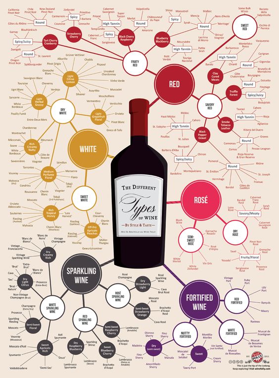
wine chart

This information design is successful because it appeals to the eye in that there is an array of color throughout, allowing the viewers eye to jump around; it also appeals to all kinds of people as not everyone has the same taste in wines and the design helps the viewer to find a type they can identify with. Furthermore, it gives options to help the viewer branch out and experience new wines and tastes. I feel like these spider-webbed graphic organizers have been outdated and this was a perfect way to incorporate them for each kind of wine.

Here is a link to the website which was linked to this photo on Pinterest.

Identity System

manduka

Manduka is a company that sells yoga paraphernalia and is inspired by the responsibility to reduce global consumption by making better products for our earth that last longer. I admire its identity system because it truly sums up everything about the company and their products.

The circular design is located on every piece of Manduka equipment. The frog symbolizes the eco friendly, organic materials used for their products as well as good grip technology that every yogi seeks on their mat. I enjoy that such a simple creature can have so much meaning for a yoga store. As a Manduka consumer myself, I can vouch for its Identity system because my yoga mat is better quality and has lasted longer than any other one I’ve owned.

If anyone else practices yoga and is interested in their products, here is the Manduka Website. I highly recommend!!!!!

Ambiguity of Positive and Negative Space

martini

This logo caught my eye because of its positive and negative space which is used to create two images as one. One can see that the artist paid just as much attention to the space surrounding the object, than the object itself. The logo easily explains what its trying to advertise and its fun use of positive and negative space can sometimes trick our perception and be pleasing to the eye as it goes back and forth between the two images.


Seen in the Real World

Here is an interesting business card I took from a restaurant in Greece this summer. It caught my eye because it had two flaps instead of one, so it opened up like a little story book. To give an idea for the viewer, the restaurant was right on the water and had a beautiful scenery. This design captures that moment with just simple text, color, and object choice.

The different paper boats are made to represent the hundreds of sail boats that pass by the restaurant everyday. The color choice of the blue text and white background represents the colors of the Greek flag for a traditional feel. The name of the restaurant is all lowercased and in rounded type, which calms the viewer to replicate the relaxation that comes from eating at this serene restaurant. The same goes for the overall design as it is clean and has a lot of negative space, just like the location, as opposed to too busy.

omilos.png

History of Graphic Design

Jake Paul White is a graphic designer whom I follow on Instagram. He is also a yoga teacher, which helps inspire his unique branding solutions. His ultimate goal is to inspire conscious entrepreneurs through his work. One project where he does so, is  his logo for a company called Clean and Conscious, a healthy 21 day online healthy program.

Screen Shot 2018-02-18 at 1.56.52 PM

Here he designed a minimal, geometric, interlocking logo that represents each theme of the program. The first theme is Grounding: simplifying food, getting back to nature and whole foods with grounding yoga and meditation practices. The second theme is Energize: exploring yoga practices that support the physical and mental energy connected with the dietary changes. The third and final theme is Awaken: adding more healthy grains, eggs and some meat, to move forward with fresh awakened perspective on how to integrate yoga and healthy eating into our daily lives. I think this is important for students to see how such a minimal design can contain a much deeper meaning without having to necessarily show it.