Online Portfolio

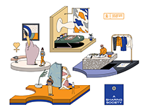
http://www.Behance.net is an online platform used to showcase creative work and allow designers to become known. Behance gives designers the opportunity to post their work in one place so it can be broadcast widely and efficiently. This allows companies to explore the work and access talent on a global scale. This is done through profiles comprised of “Projects”. A Project is compiled of images, videos, and other digital content. Every Project has a specific URL that can be shared all over the internet and leads back to the site. You can also follow the profile of other members of Behance and visa versa. When you follow someone, their uploaded content and other interactions appear in your Activity Feed where new work is being posted and updated constantly. Behance.net is free to use however there is an optional paid service called “Prosite”. Prosite allows you to build a customized portfolio and costs $99 per year. Although, you’re an Adobe Creative Cloud member, it’s part of your membership!

CP Summer/Spring CollectionArt Direction & Branding STUDIO MATTA OFFORMSHARE-RITY ROOMIn TouchMazda 6Insoapropriate

Self Promotion

This is a self-promotional piece I came across on www.behance.net from artist Citra Kumala Birowo. Self Promotion “Christmas Edition” is a set of the artist’s portfolio and resume. The concept of this self promotion is about giving someone a gift. This project was created a few weeks before Christmas, so for that reason the self promotion looks like a Christmas present. The designer states the main design looks like a Christmas wreath formed in letter “C”. The rest of design uses orange and brown color to show the warmth of Christmas. However, the actual gift is not the portfolio book. Instead, the chocolate bar inside the box is used to be a creative media for her resume. On the label, it contains all her biodata, personal information about her education, my skills, and etc. The plan is when someone or a design agency receives the gift box, when they read the portfolio book and also eat the chocolate bar that has been inserted. Under the chocolate bar, you can find a flashdisk which contains softcopies of her portfolio. I feel this piece was very successful because it is creative and well thought out from every aspect. You can see more photos of her project here: https://www.behance.net/gallery/12758153/Self-Promotion-Christmas-Edition


InspoFinds

While researching this assignment, I came across a website called inspofinds.com. The goal at InspoFinds is to promote and celebrate latest design work, up and coming designers and the design community. Aside from showcasing designers work online, InspoFinds publishes a collection of books featuring 365 design pieces from fresh graduates, designers and agencies. I was most drawn to this blog is that it celebrates inspiring designers and gives them a platform to become noticed. In particular, I was inspired by a packaging project from student Josephine Hermanto for her brand Smooj. You can find it here https://inspofinds.com/blog/smooj .

Information Design: Why Do Freeways Come To A Stop?

I was first drawn to this diagram because of the content it was covering. The title “Why Do Freeways Come To A Stop?” is something I’ve always thought about and the visual description really helps to grasp it. Where the road bends helps to show where traffic slows down and jams up which is a good example of an information design because your mind easily makes the connection. I also feel the design is very youthful and easy to read and comprehend. The funnel effect is also easy to understand based on the images side- by-side. The faint red oval behind the second funnel also helps to easily make the connection that there’s a problem with that method.freeways

Ambiguity of Positive and Negative Space

One of the most known logos worldwide is Apple. This logo is a prime example of use of both negative and positive space. Apple has taken a simple fruit and turned it into an elegant, recognizable design. The “bite” out of the apple draws your eye to the design and creates an interesting contrast of both positive and negative space using black and white.

Identity Systems: USPS

The United States Postal Service logo can be recognized by nearly every citizen living in the United States. It’s an independent branch of the federal government that responsible for providing postal service in the United States and caters to both residential and commercial customers. The USPS handles the mailing of letters and packages, sorting and delivering mail, and selling products such as stamps and mailing supplies. The logo itself is an excellent example of an identity system because it is a bald eagle and represents the values, power and patriotic spirit of an American. The eagle also appears to be soaring through the air which is representative of the speed of their services.USPS_Eagle-Symbol-web-size

Seen in the Real World

This is a sign that my roommate has hanging in our apartment. It’s always been funny to me that there are very educated graphic designers that create silly novelty signs such as these. I was intrigued to chose this sign because it is printed on a mirror that is covered in glass. I’m curious to see the process behind how typography such as this gets printed on such delicate surfaces and the whole design process from start to finish.

Paula Scher

Paula Scher was born October 6, 1948 is Washington D.C. She attended school at the Tyler School of Art, in Pennsylvania and graduated in 1970 with a Bachelor of Fine Arts. It was here that she was taught the Swiss International Style of typography “Helvetica”. Today, Scher is known as an American graphic designer, painter and art educator in design.

In 1972, she began her graphic design career as a record cover art director at both Atlantic and CBS Records in New York City. Although Scher’s work spans over 3 decades, I was most intrigued with her accomplishments during this time. While at CBS she designed approximately 150 album covers a year, and produced uncountable ads and posters. During her time in the record industry, her work was described as accessible but smart. She collaborated with illustrators and photographers to interpret music in poetic ways. She used design to make visual analogies to invoke a mood or stage a scenario than provide literal depictions of bands and performers. This created an emotional impact and immediate appeal to contemporary audiences. Some of those iconic album cover designs are Boston, Eric Gale, Leonard Bernstein, Bob James, Bob James and Earl Klugh, Roger Dean and David Howells and Jean-Pierre Rampal and Lily Laskin. I was most interested to learn her record designs were recognized with four Grammy nominations. This is important since I don’t believe some people are aware this is a category of the Grammy Awards. Additionally, in the late 70’s there was an economic crash. Scher could no longer afford to put money into imagery so she began to focus on type. For this reason, she is credited with reviving historical typefaces and design styles.

Graphic Design: The New Basics

The book I read was Graphic Design: The New Basics by Ellen Lupton and Jennifer Cole. I found the chapter on patterns to be very interesting. Styles and motifs of patterns have evolved within cultures and fashion. For example, in the twentieth century, designers avoided ornate detail in favor of minimal adornment. Today, surface pattern is all about creating a vibrant composition.

The chapter states the rebirth surface patterns is due to the revival of craft in architecture, products, and interiors. In the nineteenth century, designers began analyzing how patterns are made. They found that nearly any pattern arises from three basic forms which are isolated elements, linear elements, and the criss-crossing or interaction of the two. They state that many different terms have been used to name these elements, but we commonly call them dots, stripes, and grids. For example, they claim form can be considered a dot, from a simple circle to an ornate flower. A stripe, on the other hand, is a linear path. It can consist of a straight, solid line, or it can be built up from smaller elements such as dots that link together to visually form a line. Additionally, these two basic structures, dots and stripes, interact to form grids. As a grid takes shape, it loses the identity of the separate elements in favor of a larger texture. Creating that larger texture is what pattern design is all about according to the book.

J. Howard Miller

J. Howard Miller created the iconic “We Can Do It!” American war propaganda poster in 1943. Interestingly enough, it was actually seen very little during WWII, and was intended to boost worker morale for Westingtonhouse Electric Internal War Production Coordinating Committee. It wasn’t until the early 1980’s that it was rediscovered and repurposed. It became widely reproduced in many forms, often renamed “Rosie the Riveter” after the iconic figure of a strong female war production worker. The “We Can Do It!” poster has now became an image used to promote feminism and other political issues beginning in the 80’s.

Miller was an American graphic artist who lived in Pittsburg during WWII. He graduated from the Art Institute of Pittsburg in 1939. Most of his propaganda posters and other artwork depicte the lives of the women behind the war effort.

You may recognize some of his other artwork from your history classes!

https://americangallery.wordpress.com/2009/06/02 /j-howard-miller-1918-2004/