This website seems like a good website for building a portfolio. You can build websites with them, build an online store, build a portfolio, find the perfect domain name, gives theme ideas, you can use them for your business. I think this is a really cool website and seems like you can do a lot of different things with them.You can get apps for your website and do much more on this website.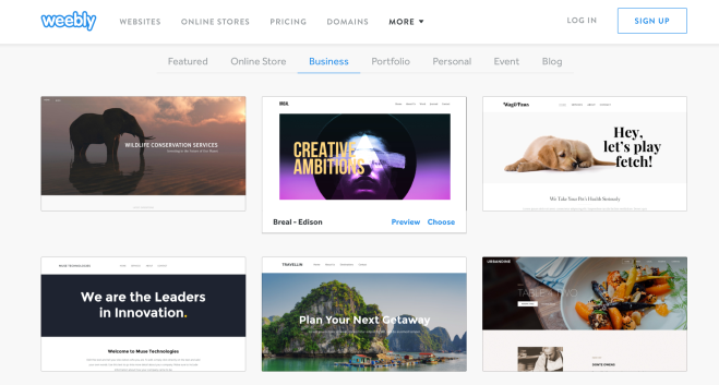
Author: daniellepincus
David Airey
David Airey is an independent designer from Northern Ireland, specializing in logo design and brand identity projects, with clients worldwide since 2005. He works with clients worldwide to grow their businesses through distinctive, meaningful, and enduring designs. Most of his work is done remotely in the town of Bangor, Northern Ireland. His website is really cool and really organized well with a lot of his portfolio work.
 design he made for the Wine Trading Company in moscow
Design Milk
This blog is a design blog with interior design, modern furniture, and art. It features interior design ideas, architecture, modern furniture, home decor, art, style, and technology founded by Jaime Derringer. I thought this was a really cool blog with alot of great ideas. They have really interesting objects on there site and is really different from other sites I had visited. They had alot of futuristic ideas which I thought was interesting
Breakfast foods: Girls vs. Boys
I think this chart is a very good example of a informational design. I think its a good example because its a very realistic design, and is made in a simple but very effective chart. It shows the different breakfast foods, and shows the different number of students. They show the difference between what number of girls that eat each food, and the number of boys who eat the different foods for breakfast. It was developed as a Joint Project of the Braille Authority of North America and the Canadian Braille Authority L’Autorité Canadienne du Braille.

Identity system: Ralph Lauren polo
Ralph Lauren Corporation is an American corporation that is well known for the clothing, marketing and distribution of products in four categories: apparel, home, accessories, and fragrances. The Company’s brands include Polo Ralph Lauren which is a great example of an identity system. The polo logo is well known and is the identifier for there brand. It is a very simple design of a horse and a man playing polo, but the design is very well portrayed and a symbol many people know of even those who dont specifically buy this brand. The logo tells the shopper the brand before even looking at the tag. Men’s Polo, Ralph Lauren’s fi rst complete line of sportswear and tailored clothing which launched in 1967. In 2014, Women’s Polo was launched. They also have Polo Sport which launched in 1992, a line of activewear for sports and fitness. In 2014, Ralph Lauren debuted the PoloTech Shirt, which featured smart fabric technology. All of these polo lines include the polo logo. The logo was created by the Ralph Lauren corporation.
website:
The Mobil sign
The mobil gas station logo is one of the most iconic logos we see around today. The sign is very balanced with using its negative space and positive space. They use a white background creating lost of balanced space with the writing centered. The typogarphy used keeps it at a good balance of thickness. The blue writing, with the O as the color red makes a seperation between the two colors that creates a nice pattern. This design was made by the New York graphic design firm Chermayeff & Geismar in 1963 and it is the same design used today.
Seen in the real world
I really liked this sign advertising for the planetarium. I really liked the graphic design of this poster. The way they chose the make the people as dark shadows and the spacing they had used was really nice . I liked the whole layout of the poster.
Meggs’ History of Graphic Design
The book I chose talked about graphic design through the ages. The book is called Meggs’ History of Graphic Design. There were many chapters to this book, but what really interested me was the chapter of the invention of writing. The aurthor had talked about alot of different types of writing starting from the prehistoric era. I was really intrigued about petroglyphics which are carved or scratched signs or simple figures on rocks. I had never heard of petroglyphics before looking at this book. They are found throughout the world, whether its from Africa to North America, or the Islands of New Zealand they can be found throughout and are left by the prehistoric people. Many petroglyphs are pictographs, some could be symbols that is thought to represent ideas or concepts from the people of that time.

Wolfgang Weingart
Wolfgang Weingart is an internationally acclaimed Swiss graphic designer and typographer best known to be the father of Swiss Punk typography. He was a dedicated educator as well spreading the typography style of the Swiss whose works in typography gained him to be awarded by Swiss Federal Minister Mark of Excellence and a Doctor of Fine Arts honorary title. Weingart was most influential as a teacher and a design philosopher. He began teaching at the Basel School of Design, and he also taught for the Yale University Summer Design Program in Brissago. Throughout his entire career he spent time traveling and lecturing throughout the world.
He taught a new approach to typography that influenced the development of New Wave, Deconstruction and much of graphic design in the 1990s. While he would say that what he taught was also Swiss Typography, since it developed out of Switzerland, the style of typography that came from his students led to a new generation of designers that approached most design in an entirely different manner than traditional Swiss typography.

Graphics for change: Steff Geissbuhler
Steff Geissbuhler is known as one of the most important graphic designers and illustrators in history. He was born in 1942 in Zofingen, Switzerland, but he had moved to Basel when he was only eight years old. From a young age, he had known he wanted to be a designer, and he spent years training under Emil Ruder, Donald Brun and Armin Hofmann.
He created and executed major branding and design programs for corporations like Time Warner Cable, NBC, Voice of America, Toledo Museum of Art, and many others. He had spent nearly three decades at Chermayeff & Geismar Inc., this is where he created dozens of memorable and creative posters as the firm’s partner. He had also co-founded C&G Partners. This he had done with long-time partners Keith Helmetag, Emanuela Frigerio and Jonathan Alger.

The image above is representing the USA and the USSR, as King kong and Godzilla. The poster was made to commemorate the 40th anniversary of the bombing of Hiroshima. It is supposed to represent peace between the two nations. This poster was made in 1985.
For more of his work check out :http://geissbuhler.com/
